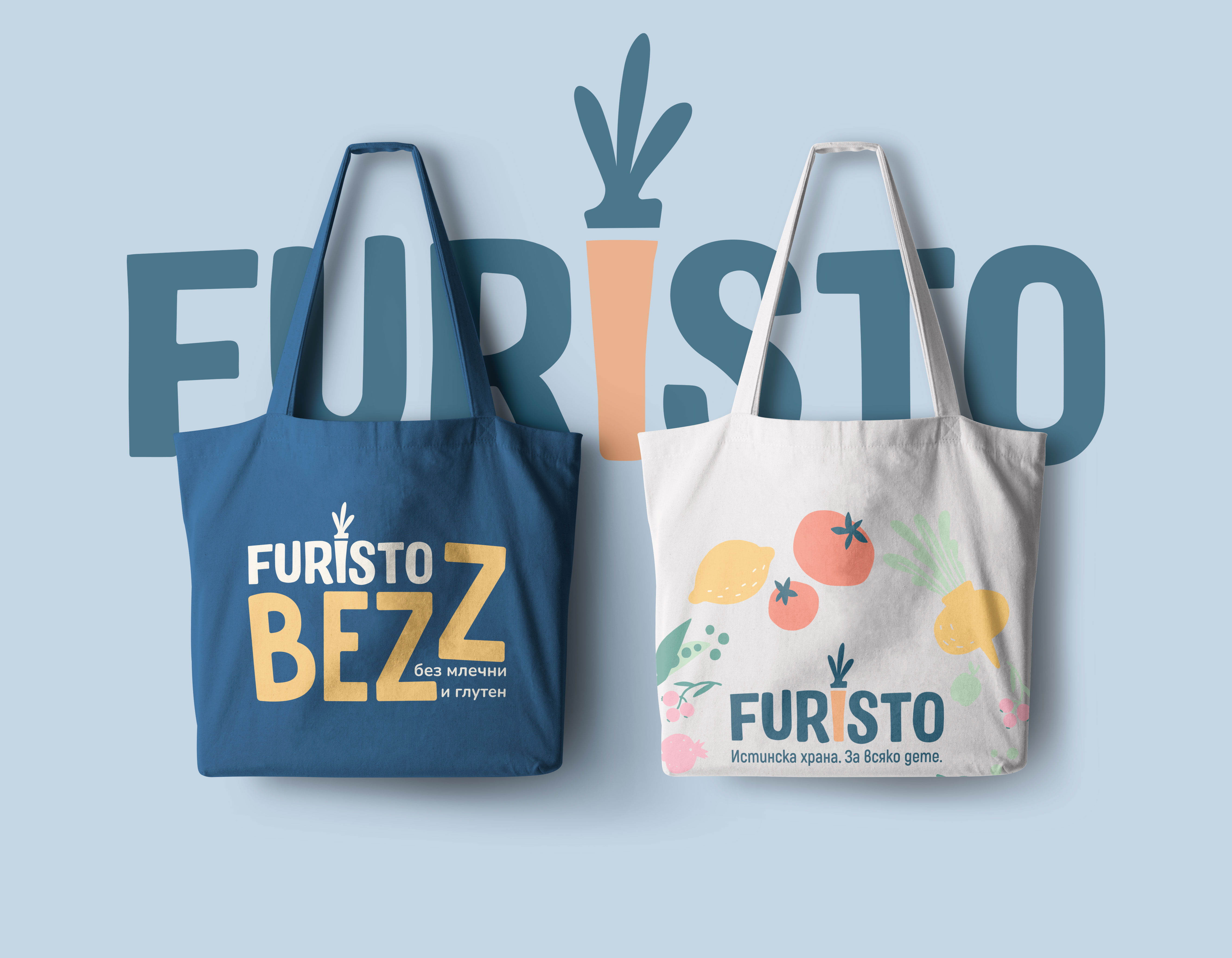
Real Food.
For Every Child.
Strategic Brand Merger, New Positioning and Design Refresh
Client: Furisto Ltd.
Category: Healthy baby and toddler food delivery
Services: Brand Design refresh - Architecture, Positioning strategy, Consumer research, Merger strategy, Logo, Typography, Color pallet etc.
The Challenge
Furisto, an emerging player in the baby food delivery market in Bulgaria, had developed a strong reputation for quality and taste - but operated alongside two other sub-brands (ZeLeo and Pureo), creating fragmentation and inefficiency.
With increasing consumer overlap and category growth potential, Furisto needed a unified brand strategy that could:
-
Integrate three brands into one without losing loyal customer bases
-
Clarify brand positioning in a crowded, price-sensitive market
-
Support future growth and distribution expansion
Strategy
How we made it?
This section is our guiding compass, the framework that defines who we are and what we stand for. These ideas form the foundation of the brand, grounding us in our objectives while inspiring growth and creativity. By staying true to these central tenets, we ensure consistency and clarity in our identity, shaping all future decisions and actions.
50
Consumers 1-to-1 researches sessions conducted:
-
11 current Furisto clients
-
12 current ZeLeo clients
-
25 overlapping Furisto and ZeLeo clients
-
2 Pureo clines
1
A Brand Audit: we did a comprehensive brand audit for each of the two brands with analysing their brand key documents, social media, packaging, communication materials
4
Internal interviews with partners and employees':
we sent a list of questions to key stakeholders to answer in order to get their feedback on the brands understanding, values, differences and commonalities, future ambitions, and plans etc.) Than we set and discuss the findings, check the ideas, clarify the points of tension.
We prepared a competitive analysis and SWOT - where we identify the strengths and weaknesses of each brand to determine what elements should be carried forward into the new unified brand. And most importantly where the brand could go next.
SWOT
Key Insights
-
85% of company volume and 80% of value were already driven by Furisto.
-
ZeLeo accounted for 25% of turnover, with a niche but loyal "100% BIO" audience.
-
ZeLeo users had lower price sensitivity, but their children naturally transitioned to Furisto products with age.
-
Most competitors lacked strategic brand communication—creating a white space for a modern, value-driven brand.
Strategic Outcome
We developed a merger strategy positioning Furisto as:
“Real food. For every child.”
Combining taste, health, convenience, and affordability in one unified brand experience.
Position Furisto Between Function and Emotion
Competitive brands were focused mostly on functional language:
-
“Fresh food”
-
“No sugar”
-
“Healthy meals”
Furisto, in contrast, already had positive brand equity based on taste and trust. We built on this by shaping the narrative around “Real food”—a phrase that resonates emotionally and functionally.
What “Real Food” means in this context:
-
Made with high-quality, recognizable ingredients
-
Cooked with care and culinary attention
-
Reflecting the values of today’s mindful parents
Leaning Into Inclusion and Access
-
Many competitors were either premium & niche (Tasty Lab) or mass but generic (Her Bebe, Jan Bibiyan). Furisto had the unique opportunity to combine premium quality with everyday access.
Positioning tone:
-
Not elitist, but confident
-
Not medical, but informed
-
Not childish, but warm and respectful of kids as people
Brand Role: Guide Through Food Stages
Instead of one static product, Furisto now plays a guiding role:
“Helping families feed their children with real food, through every stage of growth.”
This allows Furisto to:
-
Launch age-specific menus
-
Design clear product labeling and color codes
-
Speak about developmental needs with empathy, not authority
Logo
The logo is the primary representation of Furisto, expressing the brand’s commitment to real food, care, and trust for every child. It reflects the essence of natural nourishment, thoughtful preparation, and modern parenting — symbolizing a brand where quality meets everyday accessibility.

The Furisto Logo
At the heart of the reworked logo is a distinctive detail: the carrot icon formed from the letter “I”. This subtle but powerful symbol connects to health, simplicity, and nature — a vegetable not always seen as iconic, yet universally recognized for its nutritional value and earth-born authenticity. It’s a quiet celebration of the everyday ingredients that build better futures.
As a central element of the visual identity, the logo consistently conveys Furisto’s values: honesty, warmth, and care — across every product, platform, and interaction. It stands as a clear, confident mark of a brand devoted to real food, for every child.

old

new

For all LOGO: Font combination Alvania & Akrobat Bold+ manual modification


Logo & Menus versions
The result - a timeless friendly mark. And much better use for digital communication.


Typography
Typography System & Usage Rules
Typefaces
We use the Nunito font family for all communication — chosen for its modern, soft, and highly legible character.
Use Case Typeface Style Size
-
H1 – Main Headline Nunito Bold 48px
-
H2 – Section Title Nunito - Semi Bold 36px
-
Body Copy Nunito Regular - Regular 24px
-
Technical Copy Nunito Light - Light 12px
Case Style
-
Use Sentence case for most text.
-
Use Title Case sparingly for key headlines (H1/H2).
-
Use ALL CAPS only for eyebrow copy or micro-labels.
-
Do not use all-lowercase in any application.
Justification
-
All text should be left-aligned or center-aligned.
-
Right-aligned or fully justified text is not part of our system.
Typographic Proportions
All type sizes are calculated relative to the headline size (H1 = 48px):
-
Sub-headline (H2): 48 ÷ 1.3 = 36px
-
Body Copy: 48 ÷ 2 = 24px
-
Technical Text: 48 ÷ 4 = 12px
-
Quote Text: 48 ÷ 1.7 = 28px
Always round sizes to the nearest even number.
Tracking (Letter Spacing)
Nunito is designed with 0 tracking by default. If adjustments are needed for layout or visual balance, ensure letters never touch or appear too tight.
This typography system ensures clarity, consistency, and visual rhythm across every format — from packaging to digital, and from everyday touchpoints to emotional brand moments.

Colour System
Our Brand Colors: Soft, Fresh, and Modern — Friendly for Kids and Adults Alike
Furisto’s visual identity is built around a fresh, caring, and food-conscious color palette — inspired by nature, childhood warmth, and daily nourishment.
This system supports clarity, emotion, and functionality across packaging, digital interfaces, and print materials.
1. Background & Neutral Tones
These tones provide warmth and readability while evoking softness and trust.
-
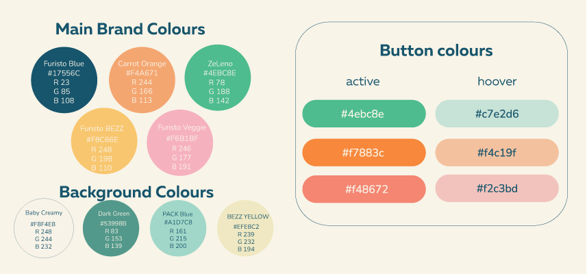
Baby Creamy - RGB 248 244 232 #F8F4E8
Soft, warm base used for backgrounds and large color fields. -
Dark Green - RGB 83 153 139 #53998B
Natural and grounded, used for contrast and stability. -
BEZZ Yellow - RGB 239 232 194 #EFE8C2
A gentle highlight tone, supporting freshness and lightness. -
Pack Blue RGB 161 215 200 #A1D7C8
Used for packaging accents and soft visual zones.
2. Key Brand Colors
These are the expressive colors that define Furisto’s emotional voice — joyful, wholesome, and nutritious.
-
Furisto Blue - RGB 23 85 108 #17556C
The main brand colour. Used for copy clarity, icons, and main brand messages — reliable and deep.
-
Carrot Orange - RGB 244 166 113 #F4A671
The New hero color. Bright, energetic, and unmistakably tied to natural food.
-
Furisto Veggie - RGB 246 177 191 #F6B1BF
A gentle pink tone that brings softness and love to the brand system. -
Furisto BEZZ - RGB 248 198 110 #F8C66E
Friendly and approachable — ideal for younger children’s menus. -
ZeLeno - RGB 78 188 142 #4EBC8E
A fresh green associated with BIO and 100% natural product lines.
3. Usage & Proportions
To ensure harmony and consistency, we follow this general balance:
-
60% Soft neutrals (Baby Creamy, Pack Blue)
-
25% Expressive colors (Carrot Orange, ZeLeno, BEZZ, Veggie Pink)
-
15% Accents & Contrast (Furisto Blue, Dark Green)
4. Function & Flexibility
Each color has a role in the brand system:
-
Cream tones for backgrounds and calm layouts
-
Brights for buttons, highlights, pack zones
-
Greens and oranges for product categories and taste association
-
Blues for digital contrast and structured information
This color palette helps Furisto stand out as a modern, natural, and trustworthy food brand — while staying emotionally connected to parents and children alike.
Iconography
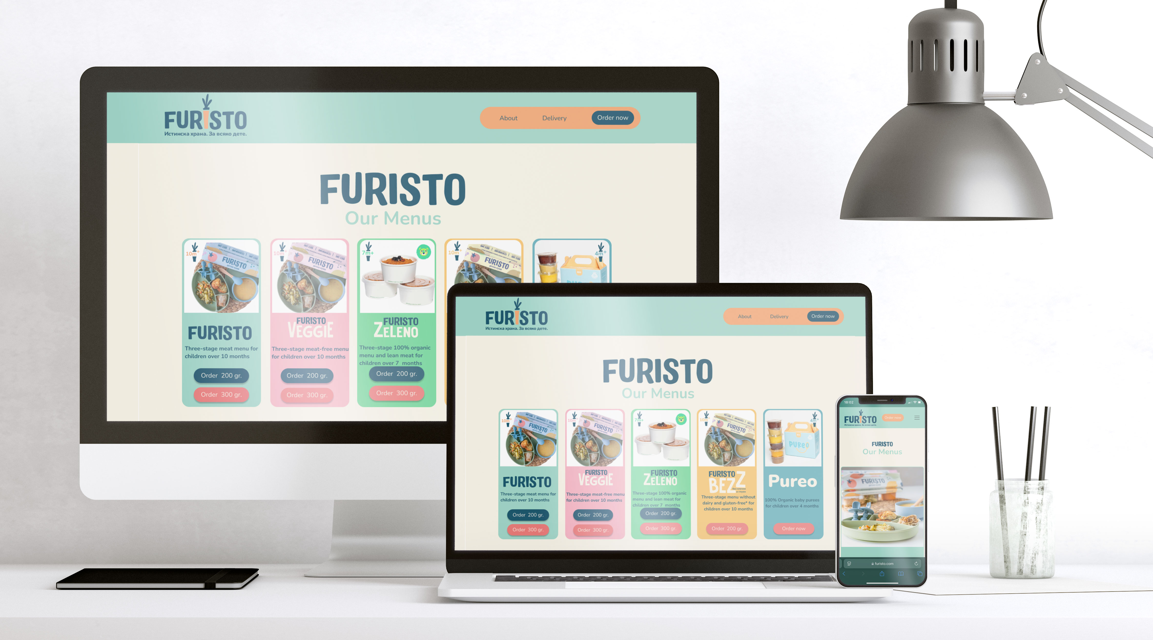
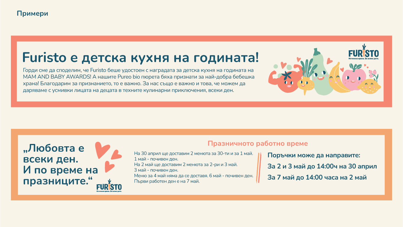
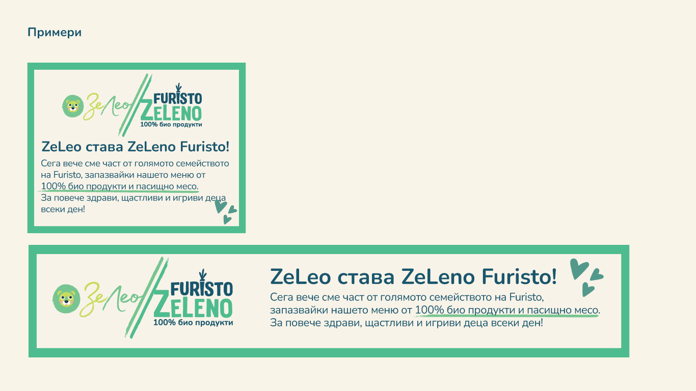
A custom icon system was designed to support the clarity of Furisto off line and on line digital experience. Icons use the new 'Carrot" Icon supporting the redesign platform
Branding elements




Not sure where to start with your brand?
That’s what we’re here for.
Reach out, and let’s explore what’s possible - together.
© 2025 by Design Studio Eleven. All rights reserved

Drop us an email: dobrin@designstudioeleven.com
Give us a call: +359 895 561 701
Follow us on: LinkedIn
