Not sure where to start with your brand?
That’s what we’re here for.
Reach out, and let’s explore what’s possible - together.
© 2025 by Design Studio Eleven. All rights reserved

Drop us an email: dobrin@designstudioeleven.com
Give us a call: +359 895 561 701
Follow us on: LinkedIn
From Information to Impact:
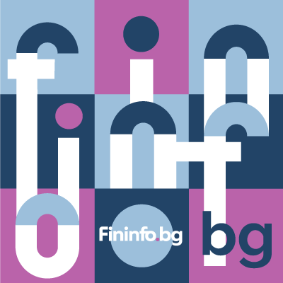
The Brand Transformation of Fininfo.bg

Fininfo.bg is a platform offering curated financial and business information, helping Bulgarian SMEs navigate data, opportunities, and decisions. The company approached Design Studio Eleven with a request to modernize its brand identity and better reflect its ambition to become the go-to point for financial insights and business connections.
The existing identity lacked clarity, distinctiveness, and a sense of forward motion. The goal was to craft a new identity system that would signal credibility, connection, and opportunity — establishing Fininfo as “The Meeting Point of Ideas and Opportunities"

Strategy
Research & Discovery
This section is our guiding compass, the framework that defines who we are and what we stand for. These ideas form the foundation of our brand, grounding us in our purpose while inspiring growth and creativity. By staying true to these central tenets, we ensure consistency and clarity in our identity, shaping all future decisions and actions.

The strategic process began with:
-
21 in-depth interviews with business partners, customers, and ecosystem players to understand Fininfo’s current perception and future potential.
-
2 strategic workshops with the internal team to map the vision, values, and unique role of the platform.
-
1 audit of visual and verbal assets to understand where the current brand was falling short
Insights
Key insights revealed that Fininfo was appreciated for its curated knowledge and partnership approach, but it lacked a memorable identity and differentiated positioning.
From this emerged the core brand idea:
Fininfo.bg is the meeting point of ideas and opportunities.
A platform that connects data, expertise, and business growth with credibility and optimism
Resolution
The rebranding of Fininfo BG delivered a powerful transformation. The new identity projects clarity, trust, and collaboration, perfectly aligning with the company’s growth ambitions. By positioning Fininfo BG as “The Meeting Point of Ideas and Opportunities,” the brand now stands out as a trusted partner for businesses seeking innovative solutions and long-term success.
This refreshed identity not only resonated with existing partners but also attracted new opportunities by clearly communicating Fininfo’s value proposition in a bold and differentiated way.
Logo
The logo is the primary representation of Fininfo, clearly conveying our brand name and essence to the world. It reflects the core idea of connection, direction, and opportunity — symbolizing a platform where ideas and specialist meet to drive business growth.
As a central element of the visual identity, the logo consistently communicates Fininfo’s dedication to clarity, credibility, and forward-thinking — across every application and touchpoint.
A visual metaphor for connection and direction.
Reworked Logotype represents the idea of a modern, connected symbol of collaboration and opportunity in different treatments enlarging the use opportunities. .

The new Fininfo logo is a visual metaphor for connection and direction — combining circles and lines into a structured symbol that hints at both a hub and a compass. The logotype is modern, stable, and approachable.

Reworked Logotype represents the idea of a modern, connected symbol of collaboration and community.


Logo versions


The result - a timeless mark. And much better use for digital communication. Resonance of the brand’s philosophy of connection and partnerships opportunities, pairing with both the brand name and its claim when needed.


Typography
A Typographic System Built on Practical and Aesthetic Foundations, Driving Clarity and Confidence
Typography plays a key role in expressing Fininfo’s values: clarity, modernity, and trust. Our chosen typefaces support a clear content structure and convey a confident, approachable tone across digital and print applications.
Headlines – Montserrat
A modern geometric sans-serif, Montserrat is used for all headlines and key messages. It offers strong presence, high legibility, and a contemporary look that reflects Fininfo’s structured, data-driven nature while staying accessible and clean. The font’s circular forms echo the shapes in the logo and iconography, reinforcing brand consistency.
Body – FiraGO
FiraGO is selected for body text due to its excellent readability and warm, human tone. Designed with a focus on multilingual support and open information systems, it aligns naturally with Fininfo’s role as a knowledge platform. Its subtle character and spacing make it ideal for extended reading in reports, articles, and platform content.
Typographic system

Colour
A Refreshed Color System Rooted in Clarity, Connection and Recognition
The Fininfo color palette is designed to support both digital and physical communication with clarity, freshness, and flexibility. At its core, it preserves and refines two recognizable colors from the original identity — Opportunity Blue and Grow Minty — reinforcing brand continuity and trust. These primary tones are now complemented by a broader, strategically selected palette to expand expression and functionality across formats.
-
Opportunity Blue provides a dependable, professional anchor that communicates clarity and structure.
-
Grow Minty injects freshness, energy, and a sense of positive transformation.
Supporting tones like Solution Quartz, Dynamic Magenta, and Friendly Yellow add vibrancy and expressive range, while Financy Blue, Calm Blue, and Violet Hub introduce contrast, depth, and emotional nuance. Together, these colors enhance recognition and build a system that works seamlessly in user interfaces, data visualizations, marketing assets, and printed materials alike.
Each tone is named with intent, helping teams communicate consistently and select combinations that evoke the right tone — whether formal or friendly, data-rich or emotional


Grids & Layout System
To ensure consistency across web, print, and digital applications, we developed a modular grid system. It allows flexibility while keeping design structured and legible.


Aplications
The new identity comes to life through clear, elegant applications:
-
Website: Streamlined, intuitive, and content-led
-
Business decks & reports: Structured with branded clarity
-
Social templates: Designed for engagement and information-sharing
-
Event collateral: Presence materials with professional edge


Sketch book sneak pick


